Before I could add extra details to the vehicle, I needed to address the feedback i received in the Alpha presentation and from classmates. It was stated that the vehicle simply looked far too cartoony and not very realistic. Almost as if it was a toy or miniature.
This was mainly caused by my roughness values which could be adjusted either in Photoshop or simply combined with a multiply node. On top of this, the metalness map was displaying only grey or black. This was due to substance designer's rendering method showing no errors in the surface reflection but as I created my main Photoshop document with masks as its backbone, nothing was ever destroyed after adjusting values. I could simply go back, select whole materials that needed adjusting and bring down a levels slider. As this was such a simple process, i added painter details at the same time as playing with roughness values so this next segment is a little out of order but still constitutes as the same stage.
With this all considered, I created three different variations to show class members and to receive feedback;
1). The original texture with its first sand pass.
2). The Mid ground.
3). The highest value.
With a monumental amount of feedback I ended up getting horribly mixed advice with a equal number of people going for each version and justifying it as the best. As this wasn't all too helpful, I eventually asked a few lecturers and decided to go on a mid-ground between the two highest values.
When it came to adding on extra details such as scratches, rust and sand, the easiest option was Substance Painter, especially as it was compatible with materials i had already created in Designer. On top of this, it meant i had to learn another software package which may be daunting and become a huge time sync but there was enough time available to do so.
I watched multiple tutorials by Algorithmic (the creators of Substance) until I got the grips of the software although this didn't end up being a monumental task; coming across as a mix between substance design and Photoshop, basically exactly what i was trying to convert Photoshop in to prior with all the masks.
As the exact same process was taken for both the gun asset and the vehicle, I'll only be covering the vehicle.
After importing the vehicle and applying each of the maps on a fill layer, I was given this as a starting point;
With roughness and metalness values fixed, it left me with the overly clean car body. I wanted everything at this stage to be mine so i refused to even touch the pre-made materials and instead, exported my sand texture and basic rust texture from Substance Designer alongside a set of parameters so i could further edit them in Painter.
These two materials made up 90% of the Painter touch-up details and after a lot of experimentation with the brushes, i found that a combination of "Pencil" for straight lines, "Sandpaper" for rougher areas and the multitude of scratch bushes for body detail made for the best combination.
For each new material, i created a fill layer with a black mask. This way i could just draw in white where i wanted a material in the exact same way i had been structuring Photoshop. Alongside this, it meant i could adjust the grey-scale value of the brush at any time to change material opacity.
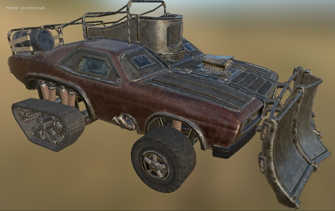
With the rust detailing layer;
The whole premise of the rust detailing was to pick every edge in the entire model that would be caught by the sandstorms and other elements, breaking them up slightly and in turn, defining the geometry of the car greatly. As you can see from the comparison shots, the window frames, rims and other large, metal components are a lot more pronounced now. I believe this alone doubles the texturing quality. I went over almost every area of the car with varying scratch brushes where necessary, especially on areas such as the main body to make it look just a lot more battered and lower its gleam when its hit by the desert sun.
With the sand detailing layer;
Now, this one was a nightmare. It seemed impossible to get the sand location and intensity right so i ended up with upwards of ten different variables. The main problem i faced here is that the sand looked horribly out of place unless it was within the environment. Once i began exporting the textures out and applying them to the physical scene, it made the process much easier. I believe im set on this now after adding some sand spooling but i cannot get the roughness perfectly where i want it.
Final little additions.
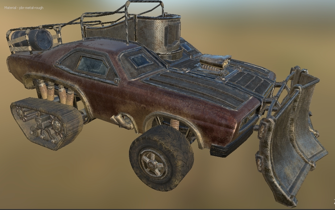
As the vehicle rubber looks fairly dull, i wanted to just add a little something to spruce it up. A slight metal contrast did the trick as both the wheels and tracks had metal pieces in the high poly model and normal map, i had just entirely forgot about this.
With the extra little addition;
I feel like this finished off the texture work nicely.
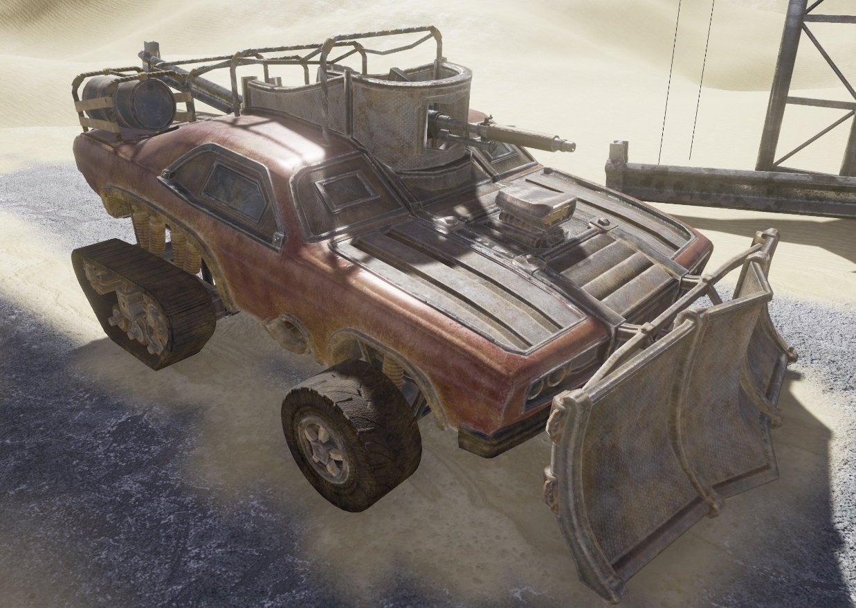
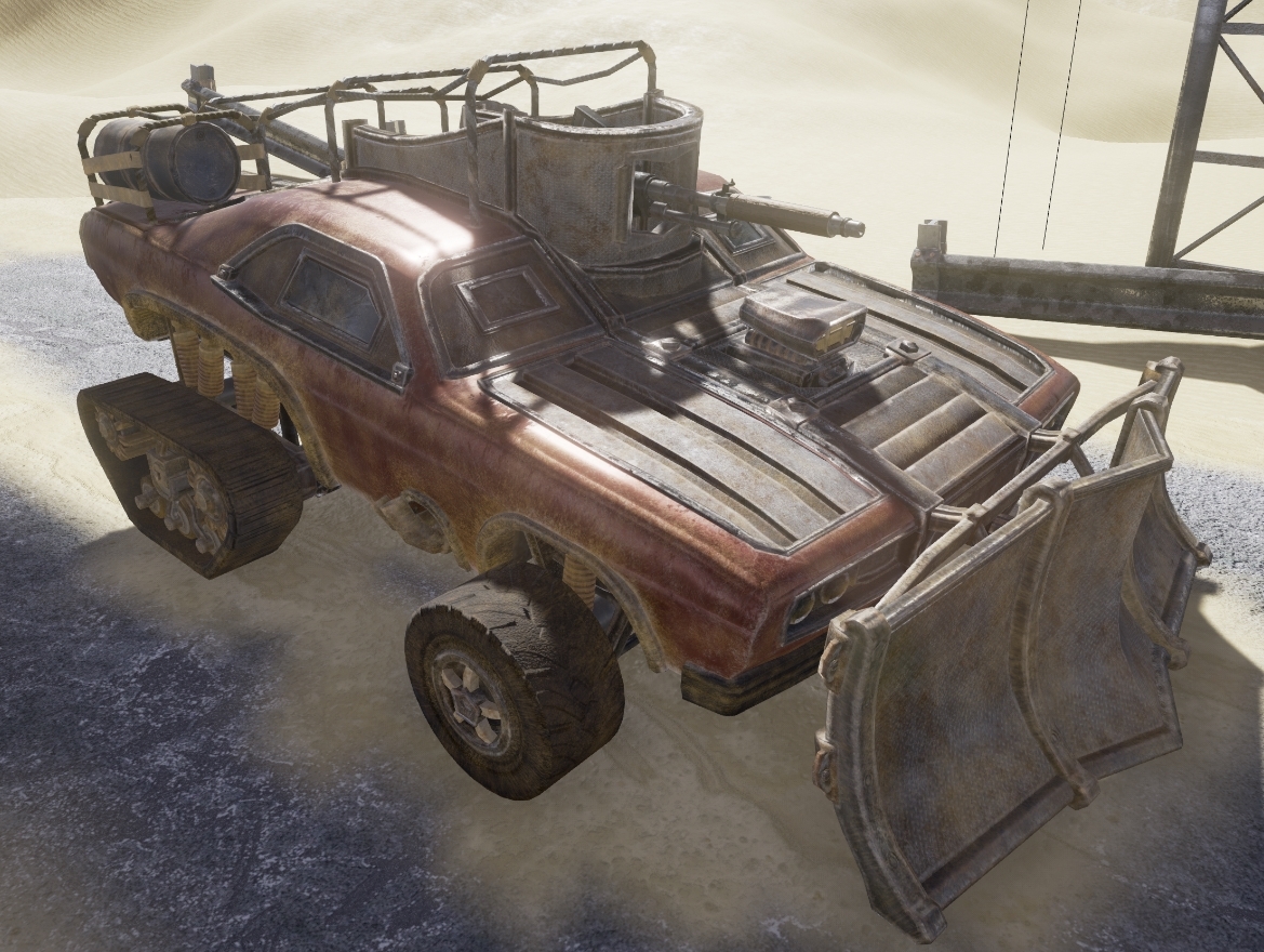
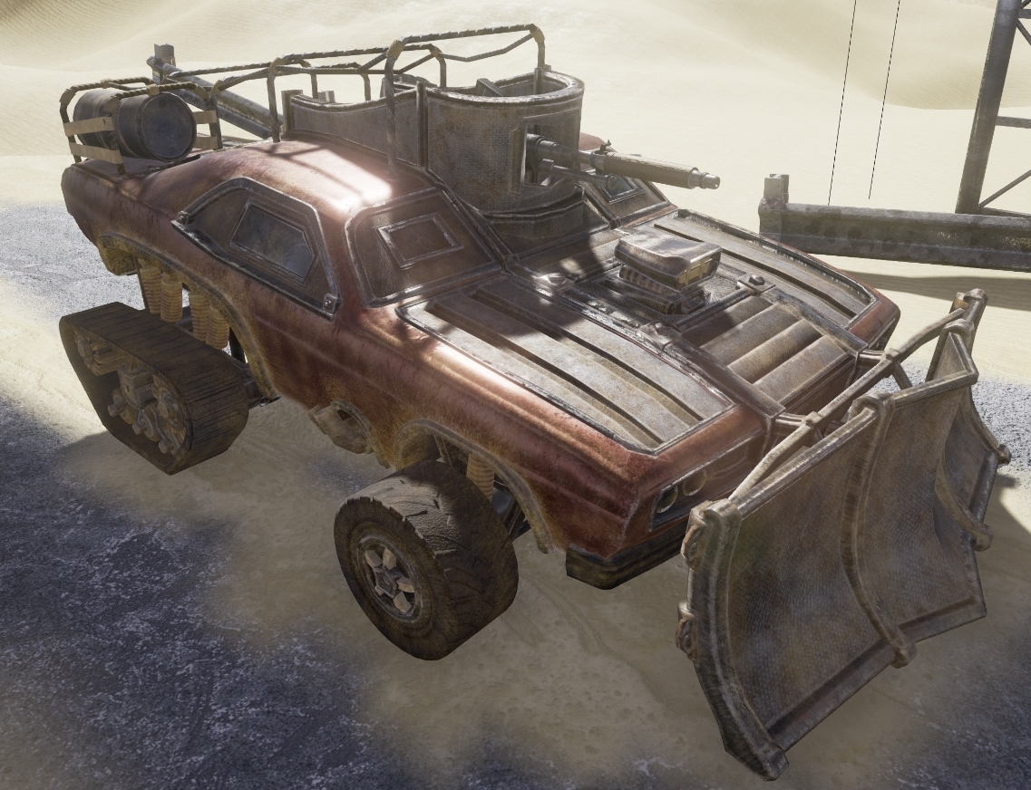
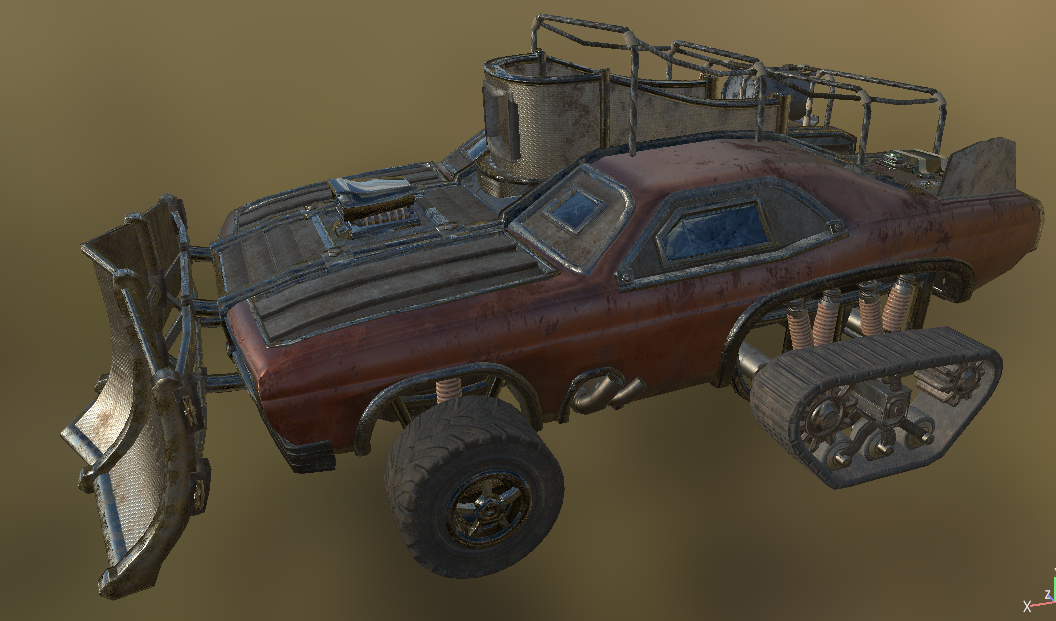
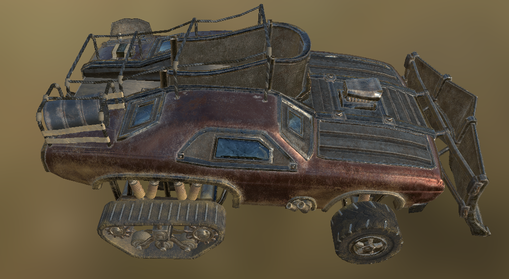
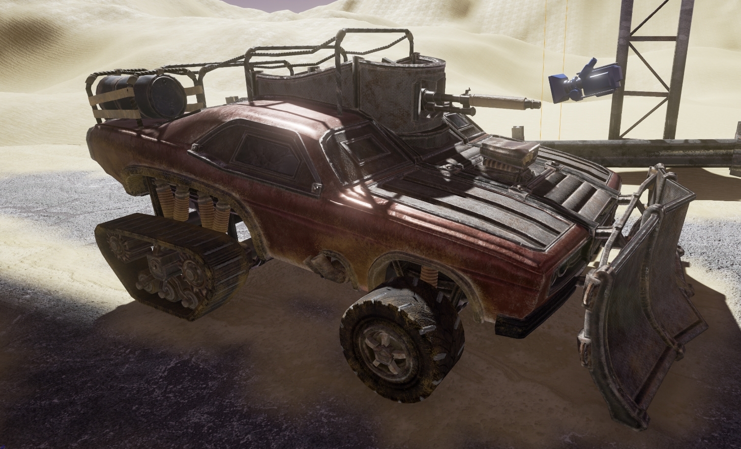
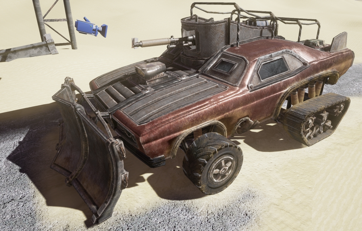
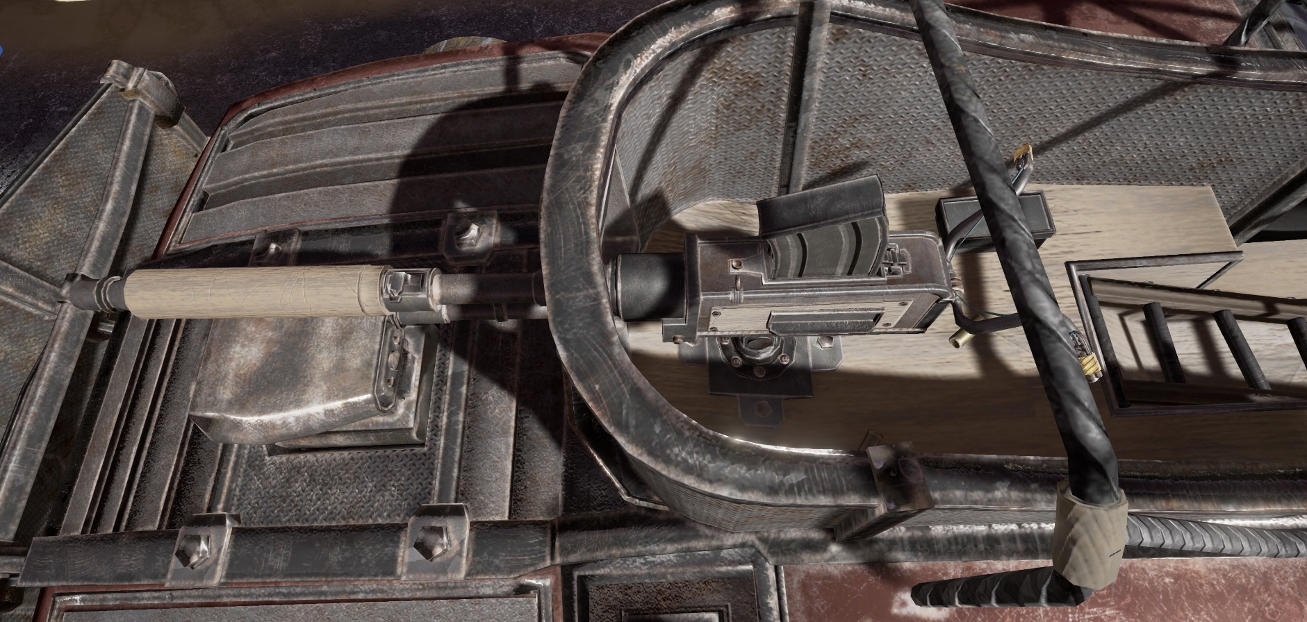
Now a few high-resolution renders from engine just to give you a better feel for the UE4 rendering;
Overall, i'm very happy with how the texturing has gone up to this stage. It was an incredibly awkward path, forcing me to learn multiple software suites and entirely re-evaluate my texturing methodology but i believe the result speaks for itself when you take in to consideration that i made every last texture for the scene out of individual nodes.
No comments:
Post a Comment