Alpha Presentation
For the most part, I believe the alpha presentation went really well. I gave a full breakdown of every stage, problems faced, the roadmap, what was left, etc... Basically ensuring that every area of the criteria was met. To make this segment easier, I re-recorded the Alpha presentation at home so it can be re-watched in hopefully the same quality as I presented it.
https://www.youtube.com/watch?v=alZcs8Eba2Y
I'll still provide a basic breakdown of each slide but that link is always available if you want to save some time.
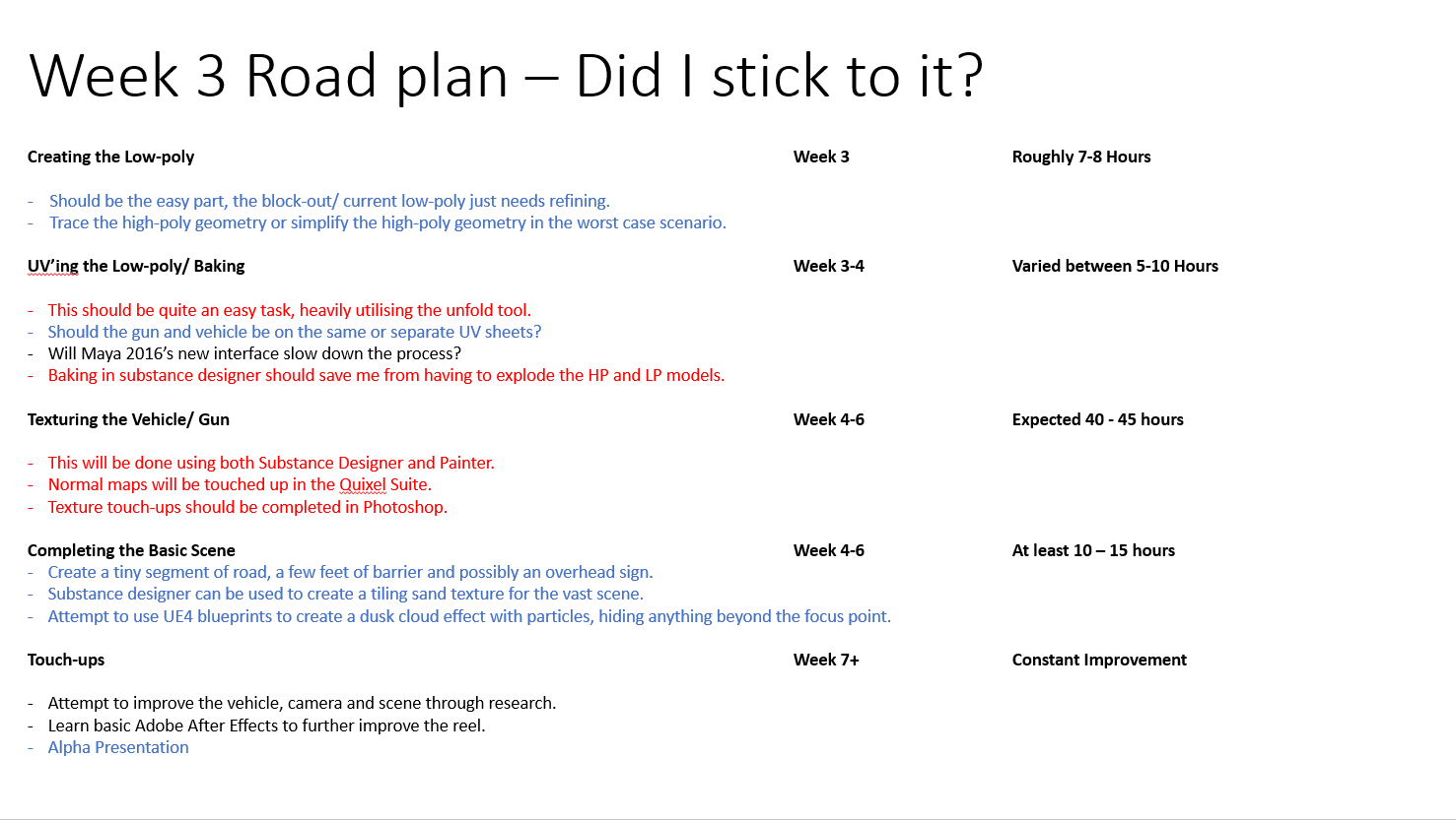
1).
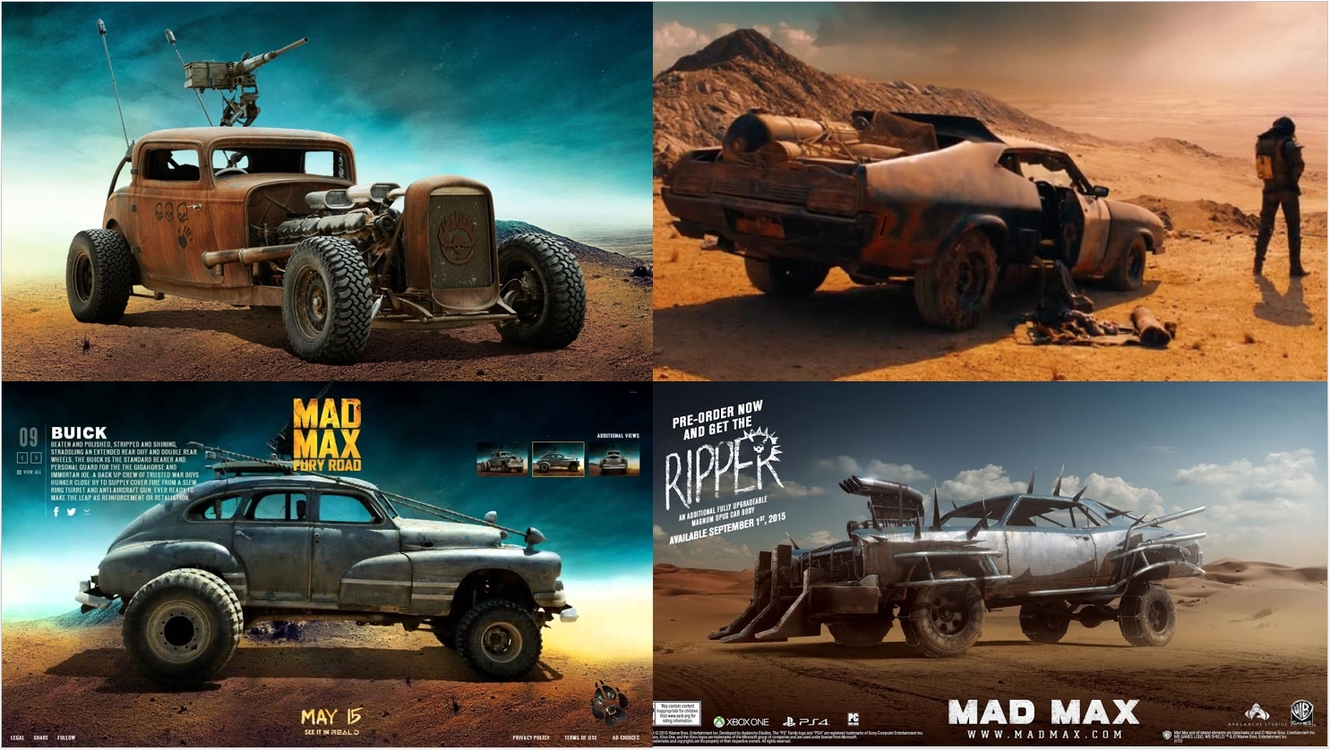
To make this presentation almost a continuation of the prior one, i used the first starting slide as it was familiar and reminded anyone watching what the original idea was before i even began to speak.
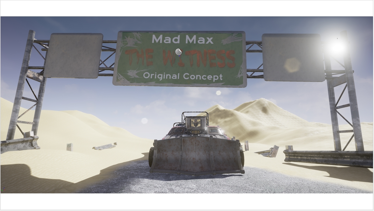
2).
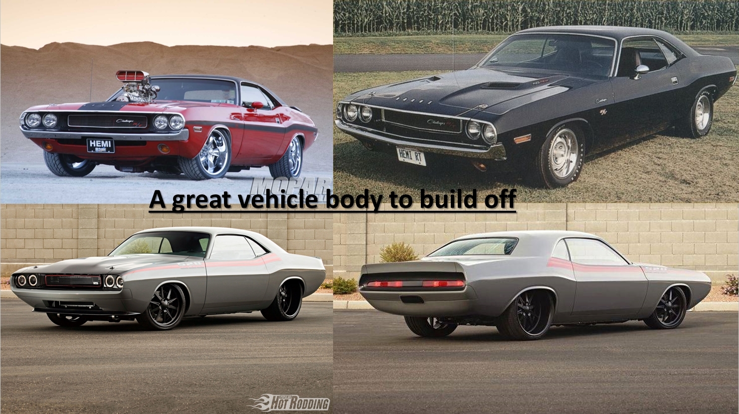
Same premise of the first slide, this worked as a good re-cap of past ideas so I could explain what the original plan was before moving on to a full breakdown of what went good,bad and how this issues were overcome.
3).
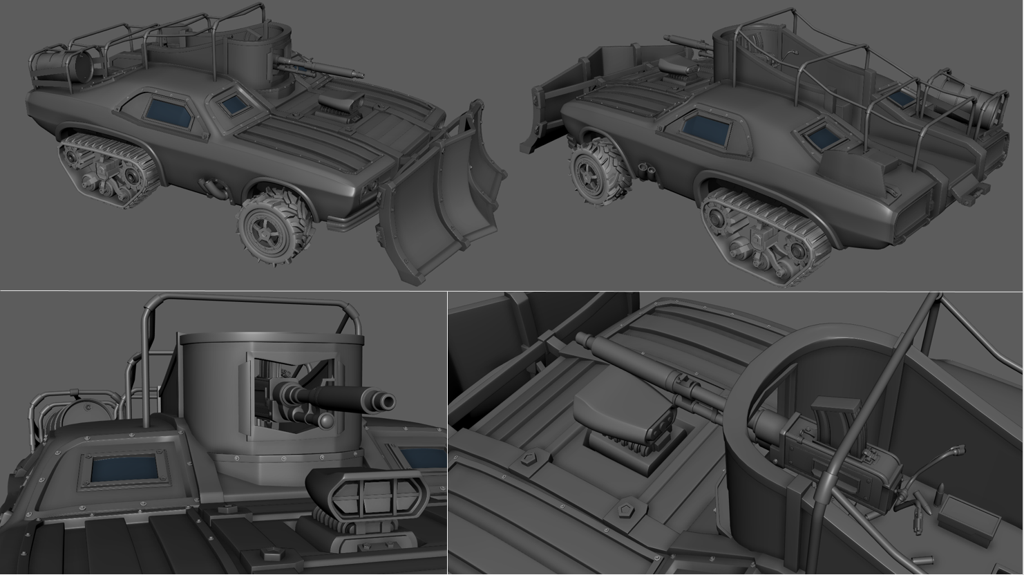
The final re-cap slide, explaining that the high poly model was completed for the last presentation and that the low poly model was underway. This then paved the way to the full breakdown.
4).
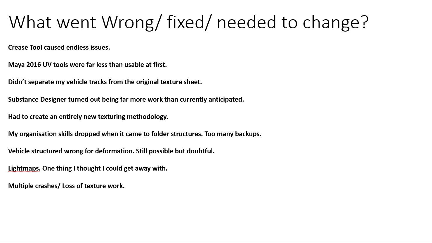
This slide is covered in great detail in the video I linked at the start and took up a large chunk of presentation time but on its own managed to cover a large amount of the total presentation criteria as a fail-safe if I were to get cut-off at the five minute mark.
5).
Simply covering the prior slide in slightly less detail, this was a breakdown of areas i stuck with in blue and areas that i struggled with in red such as having to entirely develop an new texturing methodology.
6).
This was the actual matinee sequence with some heavy Sony Vegas video editing. Probably the easiest way to access this would be to load up the original video I linked as it also comes with full narration/ commentary. Whilst physically giving the presentation, the projector changed the resolution of my MP4 to 4:3, ruining it to quite an extent and made the video lag terribly. I had no control over this was it was down to luck of the draw with the presentation computer if it decided to play the videos correctly or not.
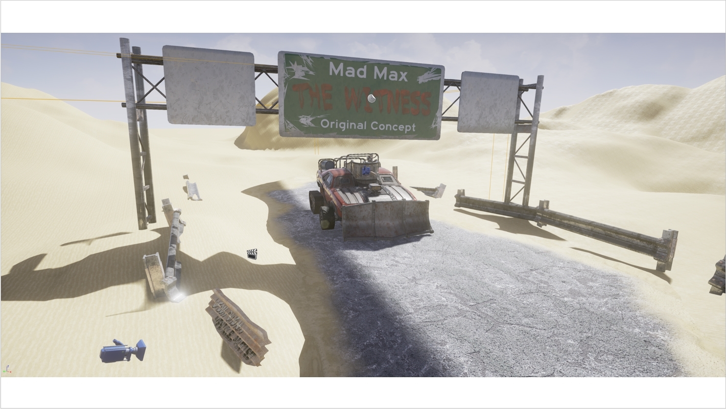
7 & 8).
These were quite literally quick, high detail shots of the scene to make up for the matinee's lower resolution.
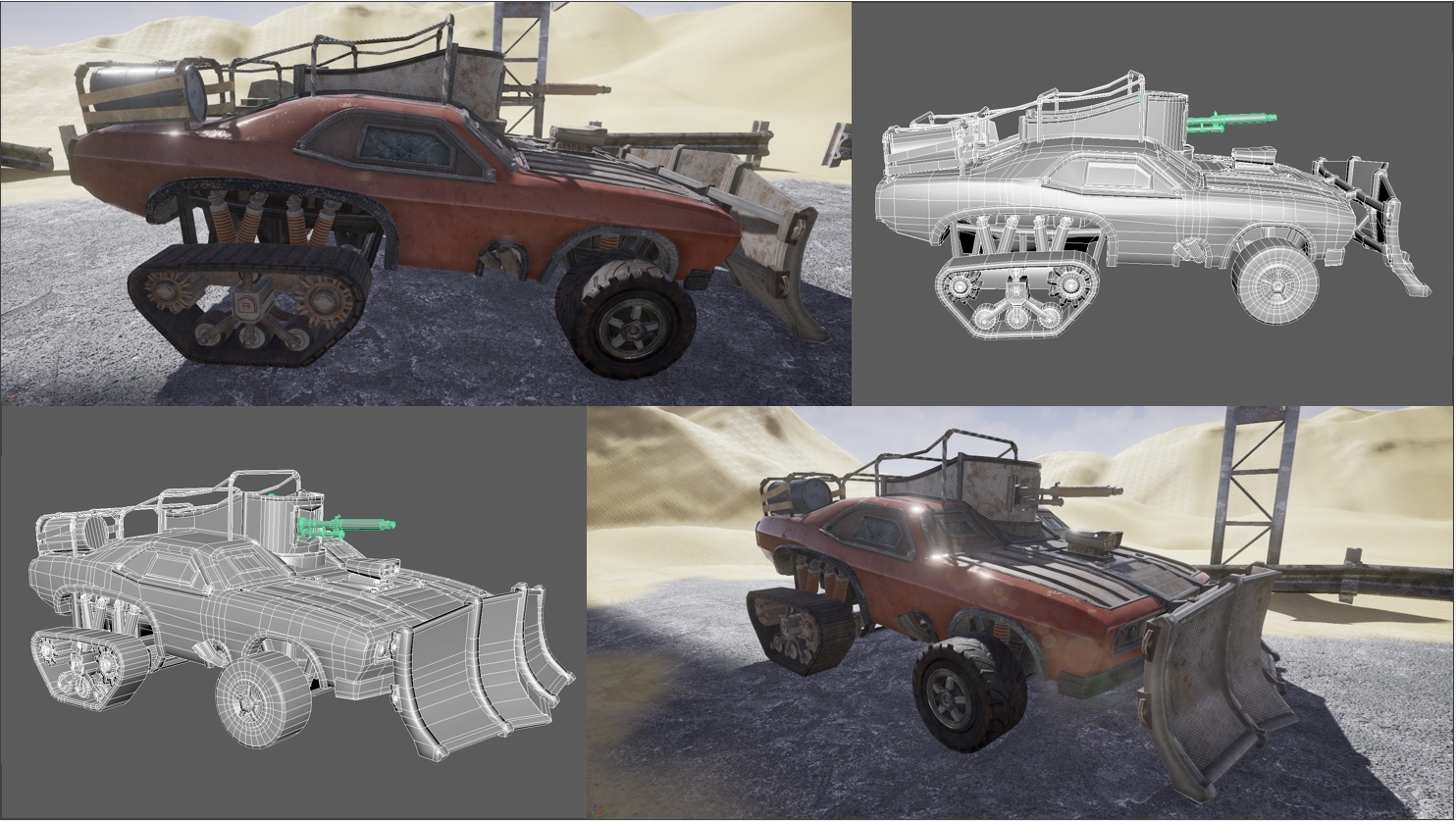
9 & 10 & 11).
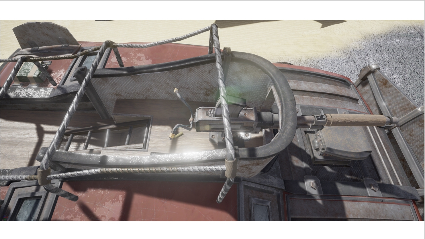
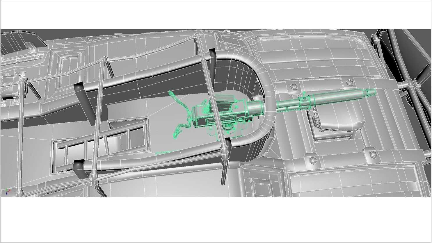
These slides let me do a quick overview of how i brought the low poly to the partially finalized vehicle with normal map.
12).
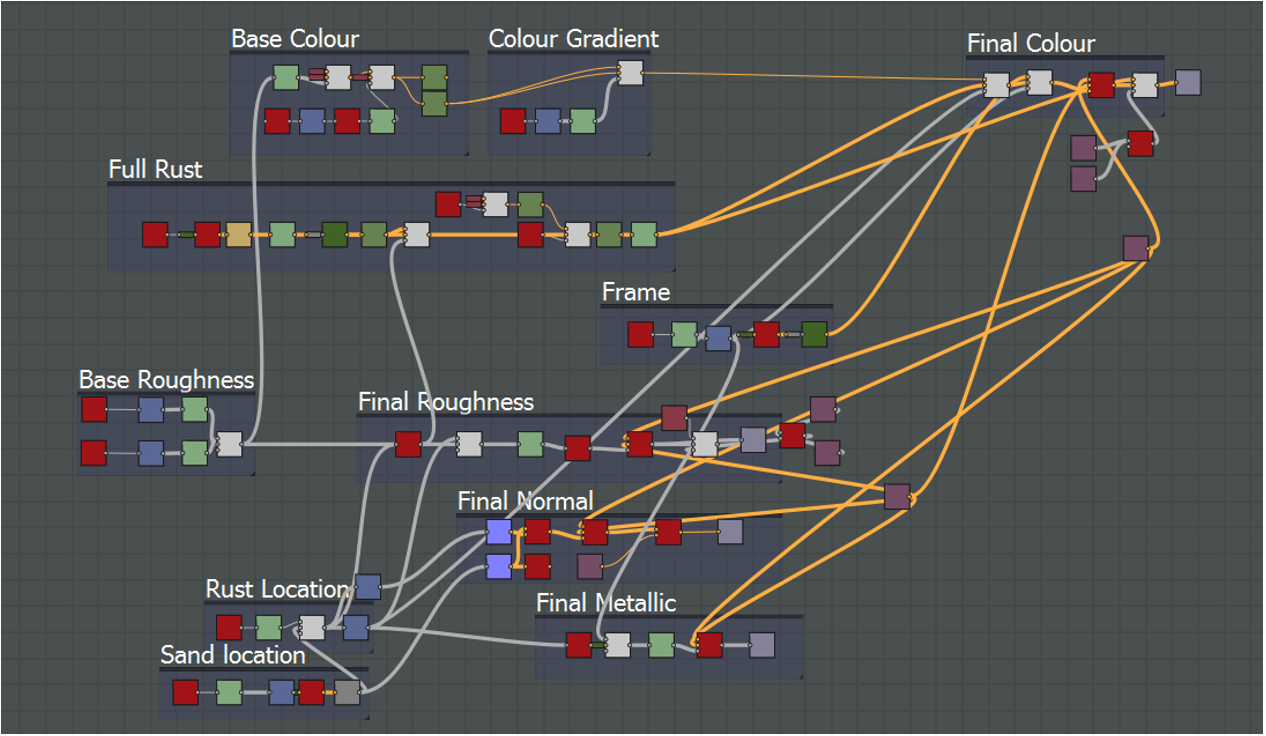
This slide was rather awkward to explain in limited time as it was the driving force behind my texture work and the seamless substance designer texture generation.
13).
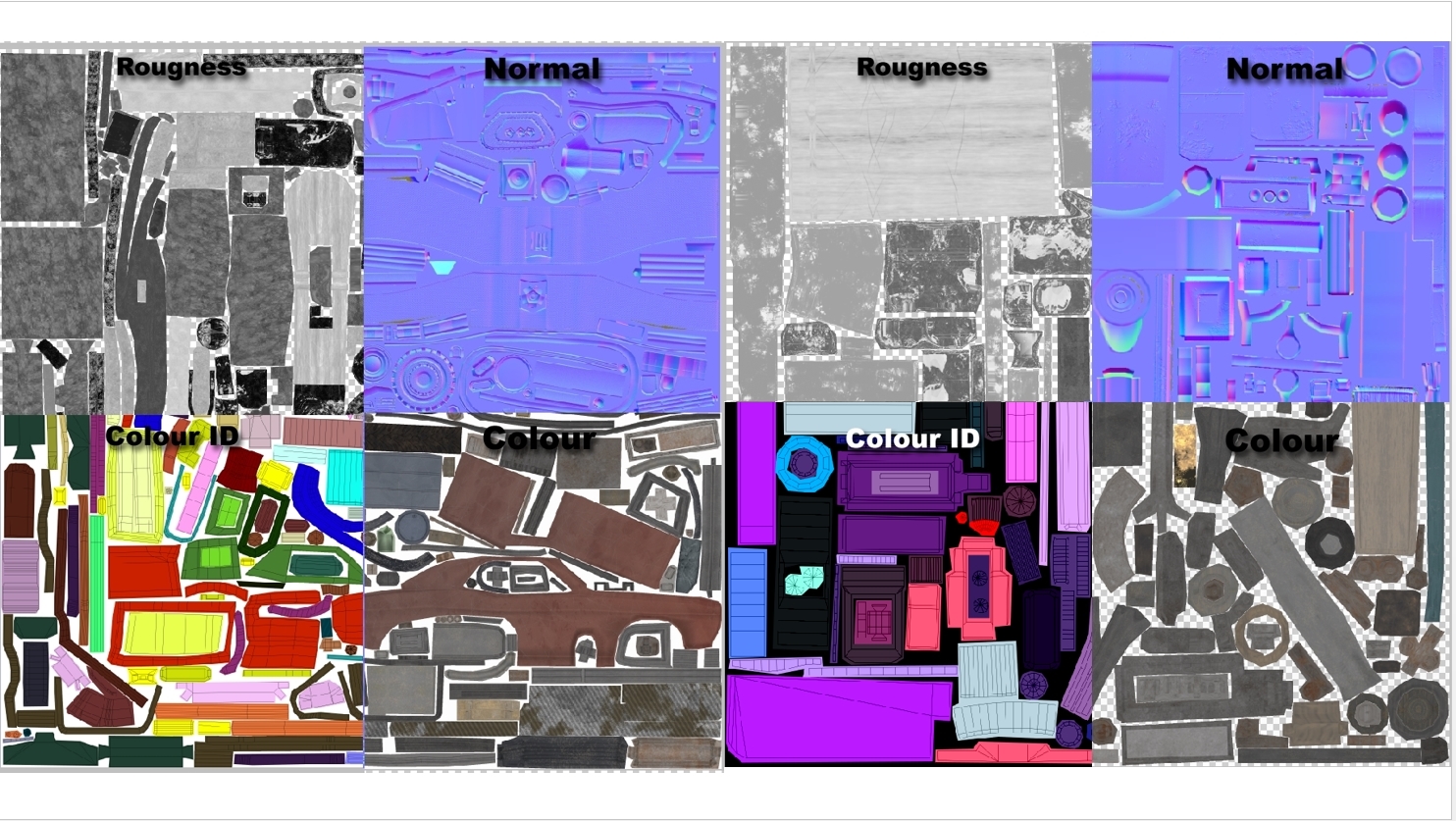
To ensure nothing was left out, I even showed snippets of each of the maps used in the texturing process just so absolutely every last stage was covered. It may have been overkill but the whole premise was the get as many people asking questions as possible.
14).
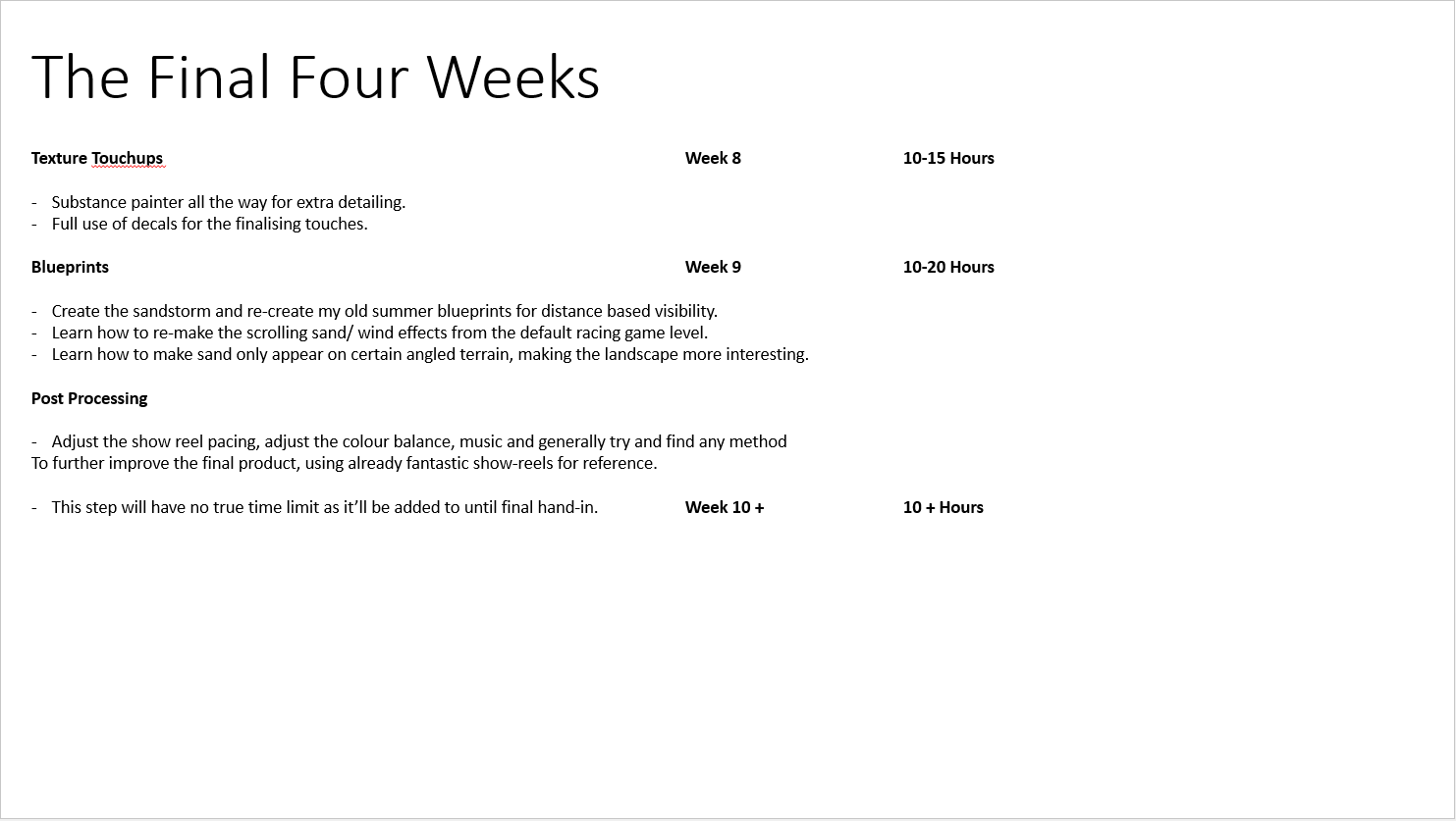
This covers the final area of the presentation criteria, going through the final month and what would be accomplished with set time frames. As i had already covered software suites extensively in past slides, not all too much detail went in to this but with the 5 minute cut-off period, it seems in retrospect, a terrible idea to put this right at the end.
Overall i received a lot of useful feedback. I really wish i had more from the class as no one exactly seemed all to talkative.
No comments:
Post a Comment