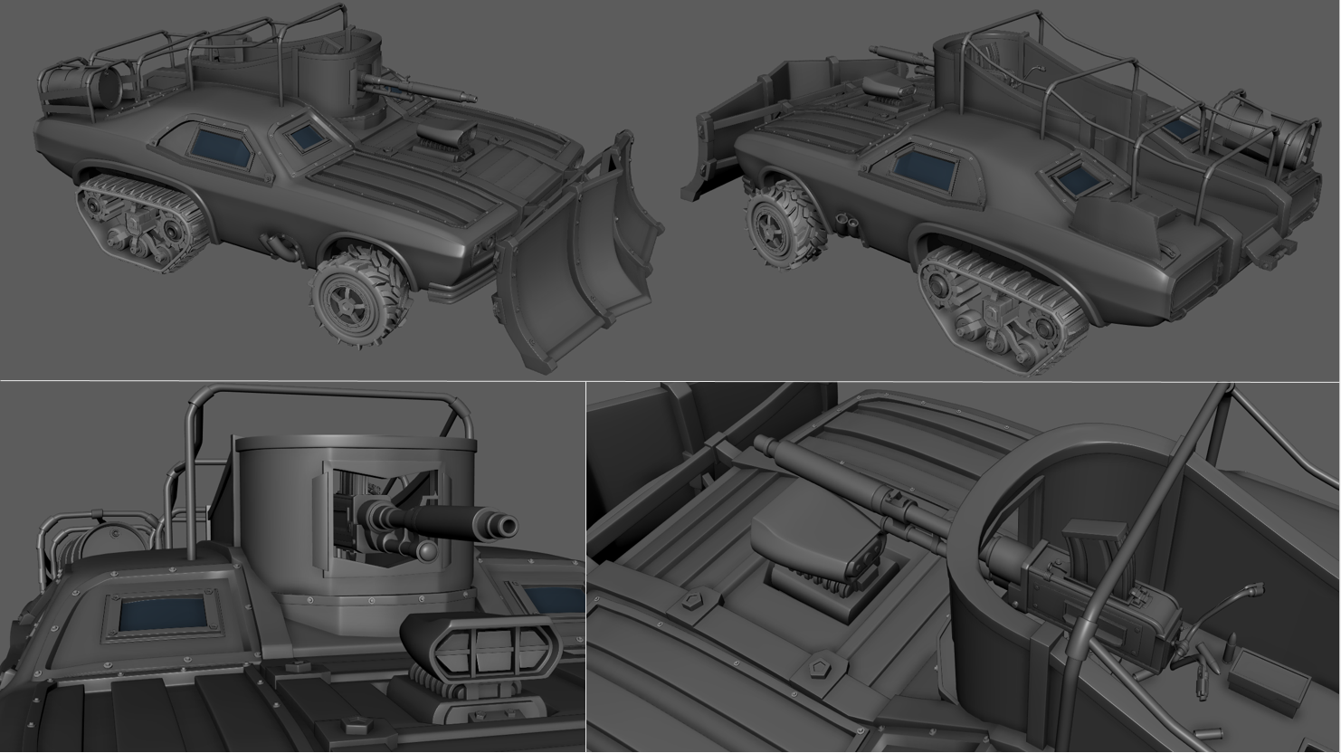
This has already been covered throughout the past 12 weeks although there is no harm putting the vast majority in one place to re-cap.
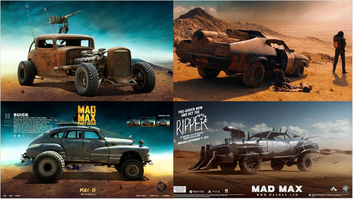
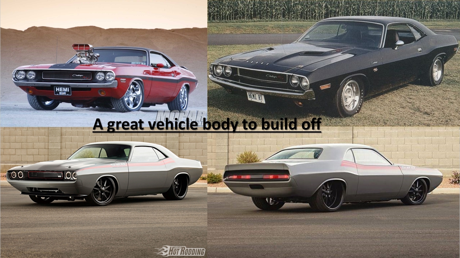
Main Reference and Imagery;
https://www.the-blueprints.com/blueprints-depot/cars/dodge/dodge-challenger-1970-2.png
http://a38898d4011a160a051fb191.gearheads.netdna-cdn.com/wp-content/uploads/2015/05/mad-max-5.png?9939c0
https://blogger.googleusercontent.com/img/b/R29vZ2xl/AVvXsEiiSIokuf9kDbAztAQDH0SrbCKjljiFueZM8oduerbLAhi5hp2JSLlK2EU0Acy3wn76ol08tE5LBvWoJdzYgWQ54wR_DXXYqaTyw1spFAeZA2fR6mPmfDQJjW5GSCJnAW8_aWf8OdtxOEH0/s1600/open.jpg
https://s-media-cache-ak0.pinimg.com/736x/58/61/89/586189da8ea5c6469a4e0090c5c51fae.jpg
http://www.fubiz.net/wp-content/uploads/2015/05/Mad-Max-Fury-Road-cars-2.jpg
http://www1.pictures.zimbio.com/mp/Wc8w_JNPPU8x.jpg
http://www.fubiz.net/wp-content/uploads/2015/05/Mad-Max-Fury-Road-cars-7.jpg
http://i.imgur.com/fOJMK9Fl.jpg
http://www.topgear.com/sites/default/files/styles/fit_1960x1102/public/images/news-article/carousel/2015/10/86bd515ce5d1a7b2f99aeddd1c0b1709/mad-max-image-8.jpg?itok=sSN3Home
http://www.barnesandnoble.com/blog/sci-fi-fantasy/wp-content/uploads/sites/4/2015/05/max.gif
http://madmaxcostumes.com/wp-content/uploads/2015/05/Mad-Max-Fury-Road-Rictus-Erectus-Machine-Gun.png
Wednesday, 9 December 2015
Final Presentation Notes - Project Evaluation
With the matinees rendered out, video editing completed and the project brought to what is basically a close,it was time to create the final presentation to showcase progress, design ideals and overall provide a full breakdown of the project itself. The criteria was as followed;
" As quoted from the module Handbook.
The hardest part of this presentation was to try and cram all the past 12 week's progress in to only 10 minutes and in doing so, had to focus almost entirely on the PBR texturing and workflow alongside the UE4 implementation. Covering jut the problems faced and how these were resolved seemed to be far more trouble as enough issue arrised in the project that I had to transition from an animation and blueprint focused project to full study on the PBR workflow and alternative software suites. I was able to take a lot of slides from prior presentations to show alongside each topic covered in the video and this gave it much more focus.
After watching the full 10 minute example video on UDO, i took notes on each area covered alongside the video time management although one thing really stuck out. There seemed to quite the lack of content, focusing on nothing but re-rendered matinee camera pans. All required information seemed to be covered although without reference to back up what was being said, it wasn't possible to take in/ fully understand his work methods.
After writing the full script for my presentation, I had multiple students read through it first to review the content. I had to make a few changes when it came to terminology but it came across as content complete and easy to understand.
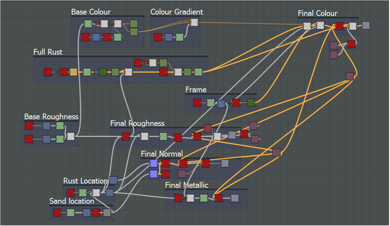
To bring the presentation to life and provide a bit more context, I recorded screen grabs and new matinees to showcase every point I spoke about. This may have not been entierly neccersary but it solved a huge issue I was having with prior presentations. As creating my new texturing workflow took me through multiple software suites and failed a countless number of times; attempting to explain the Substance node graphs as well as both the good/ bad points of node based texturing, it was far too complicated for someone who hadn't yet touched the software suite.
I feel this was essential to showcase my main node graphs in both Substance Designer and UE4 as having it visually there gives the viewer a reference point for every point i make without me having to go in to very specific details.
A screengrab of the Sony Vegas editing file;
I quite like the video presentation format although im not too sure if i prefer it over the normal, spoken format. Video wise, it ensures you can cover every point without worry and without hardly any stress/ anxiety but on the other hand, it takes much longer and if you're a perfectionist, finding, timing and adding suitable media is far from a quick task.
Overall, i very much like the final product although the texturing skills and new workflow are far more benficial than anything else i could imagine. The asset itself is simply a byproduct of this; a way to trial and put the new methodology in to practise. With my new knowledge, i hope to further improve my texturing ability and create more original MadMax vehicle concepts in the future.
Before the project, i barely understood the differance between a metalness map and roughness map. Now ive taken the one skill that i had been struggling with since the PBR transition and i believe have made it one of my strongest assets. I find many people focusing on simply how to create an end result that buffers their grade but personally, the assets we produce whilst at university are all part of the learning experience. Some should fail and we should learn from these mistakes, not take easy alternatives that teach us next to nothing beyond the time efficiency of taking short-cuts.
Personally, i don't value the vehicle anywhere near as much as the knowledge. The point of this project turned out to be; "Create a new and effective PBR texturing workflow", the vehicle being a proof of concept will find a place in my portfolio and showreel for now but it's still very much disposible and there will be very little love loss when it comes time to replace it. Until then, i'll use it as a texturing and modelling benchmark that needs to be improved on in future projects.
The full video link; (Also submitted via hand-in)
https://www.youtube.com/watch?v=3D9ZewgHjPM
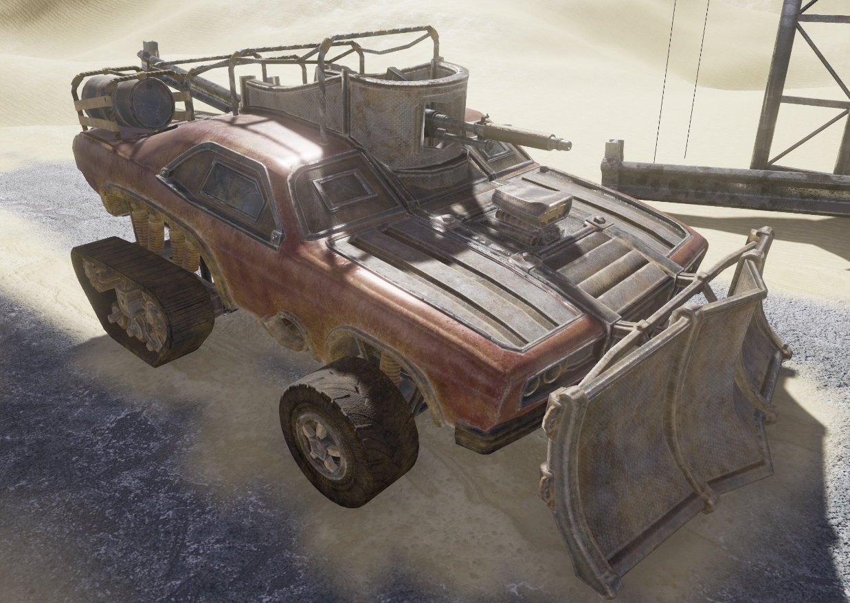
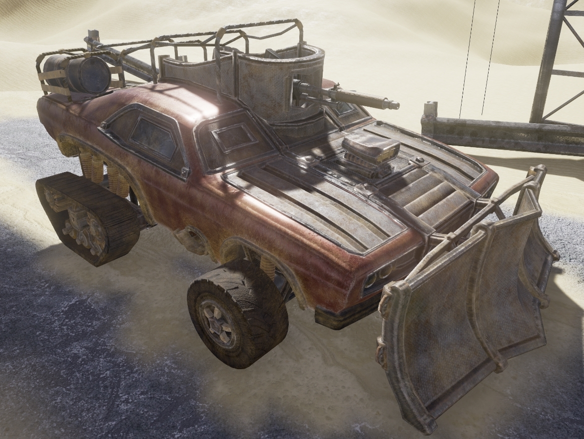
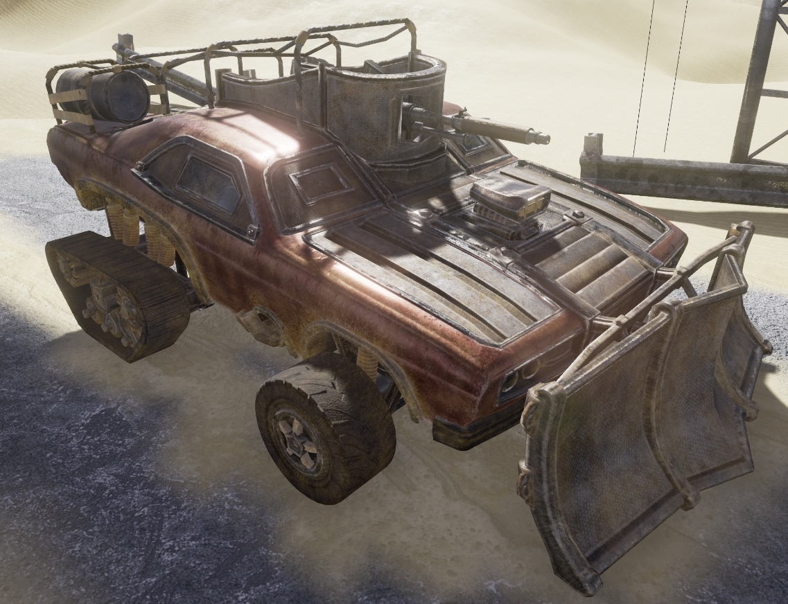
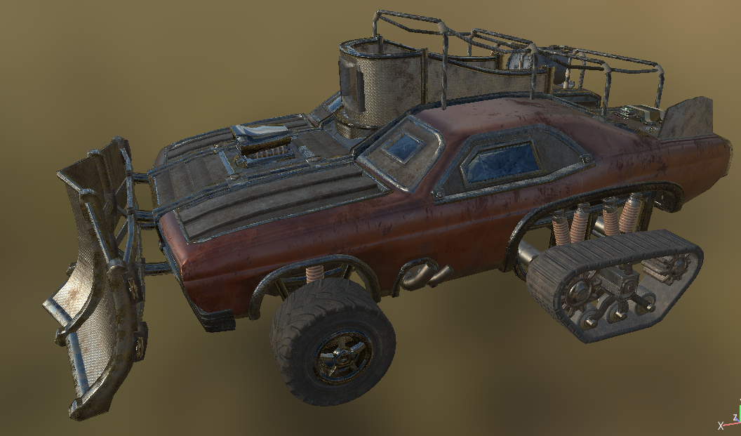
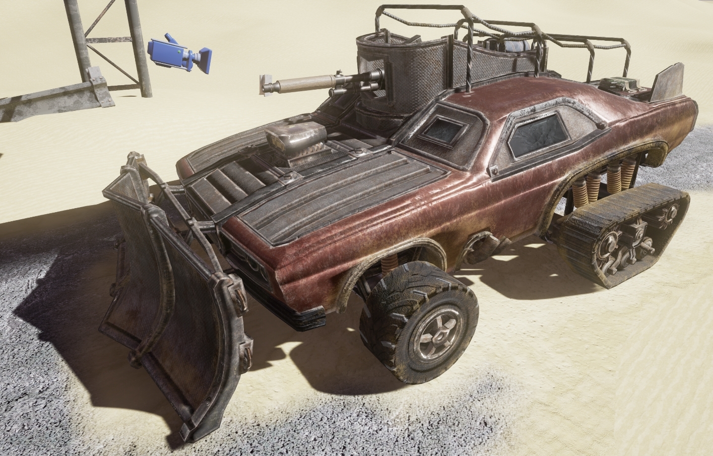
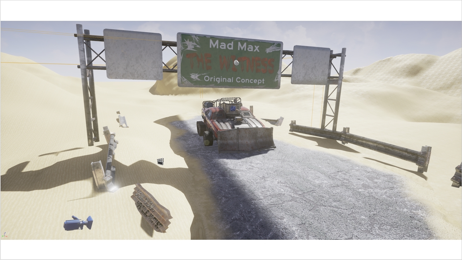
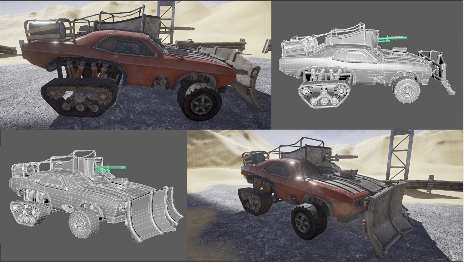
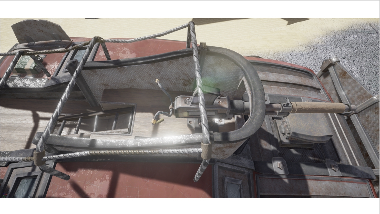
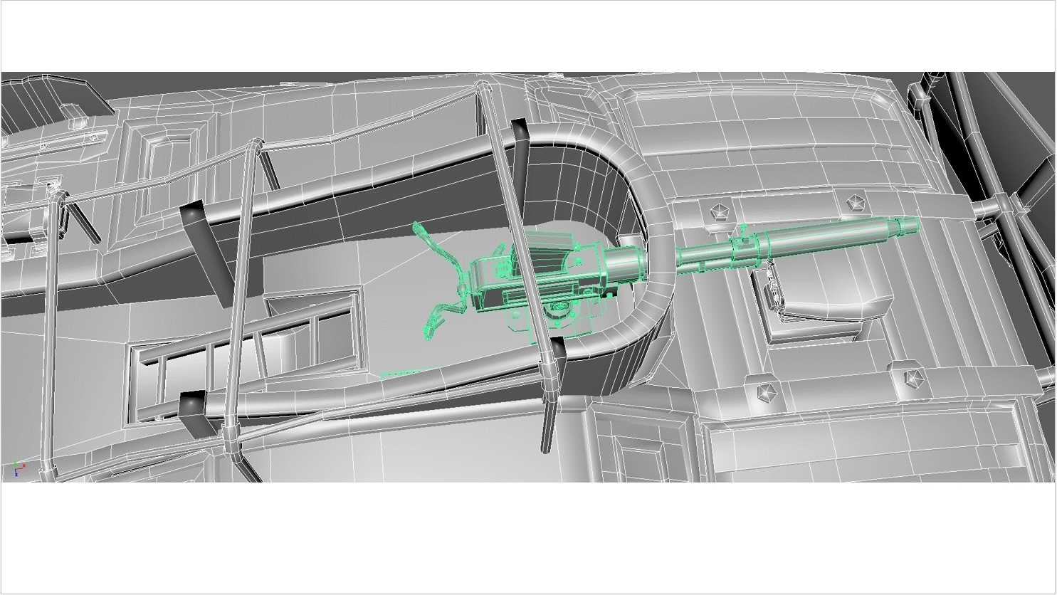
The final vehicle renders;
"You will be examined on your ability to
·
Research and implement the vision of your chosen theme, including, look,
lighting, composition
·
Design approach in conversion to real-time game environment
·
Research and implementation of
real-time rendering processes applicable
to the project
·
Scene deliverables, workload, and research and development schedule
Marks will also be given for the successful artistic and technical
implementation of the following elements in your final cinematic:
·
Lighting
·
Cinematography, camerawork and in game direction and editing
·
Materials/ Shader application
·
Texturing techniques and their application
·
Appropriate real-time modeling techniques
·
Dynamic/animated elements
·
Post processing and visual effects
The hardest part of this presentation was to try and cram all the past 12 week's progress in to only 10 minutes and in doing so, had to focus almost entirely on the PBR texturing and workflow alongside the UE4 implementation. Covering jut the problems faced and how these were resolved seemed to be far more trouble as enough issue arrised in the project that I had to transition from an animation and blueprint focused project to full study on the PBR workflow and alternative software suites. I was able to take a lot of slides from prior presentations to show alongside each topic covered in the video and this gave it much more focus.
After watching the full 10 minute example video on UDO, i took notes on each area covered alongside the video time management although one thing really stuck out. There seemed to quite the lack of content, focusing on nothing but re-rendered matinee camera pans. All required information seemed to be covered although without reference to back up what was being said, it wasn't possible to take in/ fully understand his work methods.
After writing the full script for my presentation, I had multiple students read through it first to review the content. I had to make a few changes when it came to terminology but it came across as content complete and easy to understand.
To bring the presentation to life and provide a bit more context, I recorded screen grabs and new matinees to showcase every point I spoke about. This may have not been entierly neccersary but it solved a huge issue I was having with prior presentations. As creating my new texturing workflow took me through multiple software suites and failed a countless number of times; attempting to explain the Substance node graphs as well as both the good/ bad points of node based texturing, it was far too complicated for someone who hadn't yet touched the software suite.
I feel this was essential to showcase my main node graphs in both Substance Designer and UE4 as having it visually there gives the viewer a reference point for every point i make without me having to go in to very specific details.
A screengrab of the Sony Vegas editing file;
I quite like the video presentation format although im not too sure if i prefer it over the normal, spoken format. Video wise, it ensures you can cover every point without worry and without hardly any stress/ anxiety but on the other hand, it takes much longer and if you're a perfectionist, finding, timing and adding suitable media is far from a quick task.
Overall, i very much like the final product although the texturing skills and new workflow are far more benficial than anything else i could imagine. The asset itself is simply a byproduct of this; a way to trial and put the new methodology in to practise. With my new knowledge, i hope to further improve my texturing ability and create more original MadMax vehicle concepts in the future.
Before the project, i barely understood the differance between a metalness map and roughness map. Now ive taken the one skill that i had been struggling with since the PBR transition and i believe have made it one of my strongest assets. I find many people focusing on simply how to create an end result that buffers their grade but personally, the assets we produce whilst at university are all part of the learning experience. Some should fail and we should learn from these mistakes, not take easy alternatives that teach us next to nothing beyond the time efficiency of taking short-cuts.
Personally, i don't value the vehicle anywhere near as much as the knowledge. The point of this project turned out to be; "Create a new and effective PBR texturing workflow", the vehicle being a proof of concept will find a place in my portfolio and showreel for now but it's still very much disposible and there will be very little love loss when it comes time to replace it. Until then, i'll use it as a texturing and modelling benchmark that needs to be improved on in future projects.
The full video link; (Also submitted via hand-in)
https://www.youtube.com/watch?v=3D9ZewgHjPM
The final vehicle renders;
Tuesday, 8 December 2015
Final Renders and structuring
At this stage, I had all the matinee cameras set up roughly from the Alpha and Ideas presentations although they still required a bit of editing before I could call it a finished product. Transitions inside the matinee are zero concern to me as the footage can just be heavily edited using Sony Vegas afterwards. As long as the overall media I want is recorded in the matinees, I can cut down each areas where required .
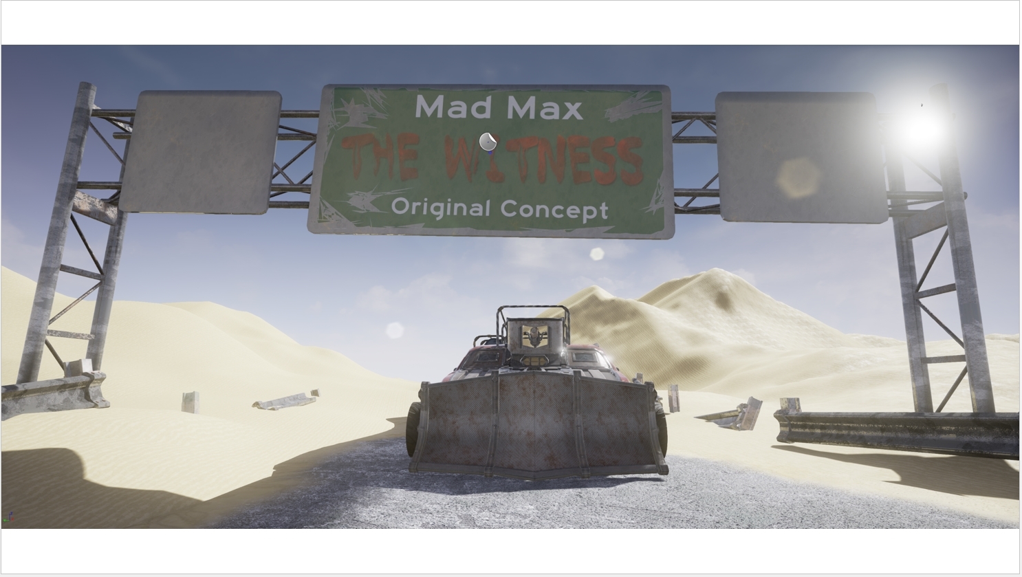
As you can see from the prior presentations below, the camera would have started, looking towards a sign before slowly panning towards the vehicle.
https://www.youtube.com/watch?v=4XtubGsEV1Q
This segment needed a full overhaul as I hadn't even considered the rule of thirds whilst setting these up. Instead I created the camera in relation to what I envisioned as a final project with heavy editing. This would have focused on the sign before allowing it to blow away via wind and gradually building sandstorm to show the sheer force. Obviously with my huge focus on PBR techniques, this was no-where near possible.
After receiving feedback from multiple lecturers, I found that the best course of action would to have the vehicle displayed in the far left sector, the background sand dune, highway props in the centre and the flaming barrel asset right up to the camera on the right hand side. This new set-up may seem rather simple but makes a world of difference. It focuses the viewer's eye on to the barrel, before transitioning this directly to the car, pulling away from the empty space, A simple camera trick but a mighty effective one.
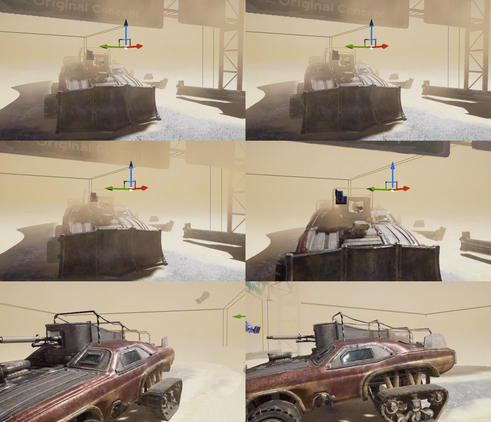
On top of this, it was suggested that I find some way to incorperate the sandstorm effect slowly rolling in, altering lighting levels to do so. Thanks to my opacity over distance node graph, this was as simple as rendering out the matinee 4 times. All I had to do was change two node values and change the global illumination value/ sky colour to match the lighting conditions brought on via the sand. This added a fair bit more motion to the scene as you can slowly see the sand-storm rolling in across each pan but best of all, it gave me a fantastic final transition with the entire highway becoming consumed with sand as the sun dis-appeared below the horizon.
Editing wise, I had to throw all four complete renders in to Sony Vegas, ensuring that the cuts and transitions were located at the exact same positions on each render. I then rendered out each one individually before re-importing them so they could be easily transitioned between.
As you can see, I also rendered out a version with the vehicle displayed as just a wire frame although i found it to be far too un-fitting in the finished project;
https://www.youtube.com/watch?v=BKfyYAxYKmM
For every stage in this process, I received an endless torrent of feedback and found this to be essential as after 10 weeks of work, I had become my worst critic.
The next and final post will give a breakdown of the final video presentation alongside a project evaluation.
As you can see from the prior presentations below, the camera would have started, looking towards a sign before slowly panning towards the vehicle.
https://www.youtube.com/watch?v=4XtubGsEV1Q
This segment needed a full overhaul as I hadn't even considered the rule of thirds whilst setting these up. Instead I created the camera in relation to what I envisioned as a final project with heavy editing. This would have focused on the sign before allowing it to blow away via wind and gradually building sandstorm to show the sheer force. Obviously with my huge focus on PBR techniques, this was no-where near possible.
After receiving feedback from multiple lecturers, I found that the best course of action would to have the vehicle displayed in the far left sector, the background sand dune, highway props in the centre and the flaming barrel asset right up to the camera on the right hand side. This new set-up may seem rather simple but makes a world of difference. It focuses the viewer's eye on to the barrel, before transitioning this directly to the car, pulling away from the empty space, A simple camera trick but a mighty effective one.
On top of this, it was suggested that I find some way to incorperate the sandstorm effect slowly rolling in, altering lighting levels to do so. Thanks to my opacity over distance node graph, this was as simple as rendering out the matinee 4 times. All I had to do was change two node values and change the global illumination value/ sky colour to match the lighting conditions brought on via the sand. This added a fair bit more motion to the scene as you can slowly see the sand-storm rolling in across each pan but best of all, it gave me a fantastic final transition with the entire highway becoming consumed with sand as the sun dis-appeared below the horizon.
Editing wise, I had to throw all four complete renders in to Sony Vegas, ensuring that the cuts and transitions were located at the exact same positions on each render. I then rendered out each one individually before re-importing them so they could be easily transitioned between.
https://www.youtube.com/watch?v=BKfyYAxYKmM
For every stage in this process, I received an endless torrent of feedback and found this to be essential as after 10 weeks of work, I had become my worst critic.
The next and final post will give a breakdown of the final video presentation alongside a project evaluation.
Monday, 23 November 2015
Enhancing the Scene - Techy Wizardry
With the vast majority of the scene finalized, there were only a few areas left to touch on. This mainly came down to the sandstorm and with zero documentation, it was a giant game of trial and error.
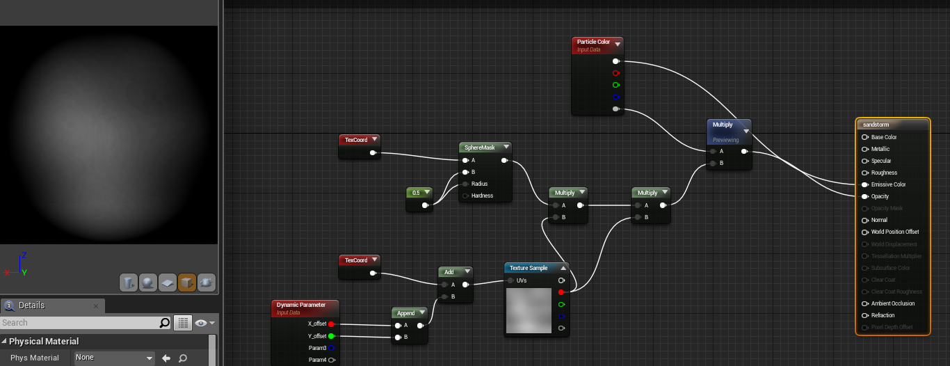
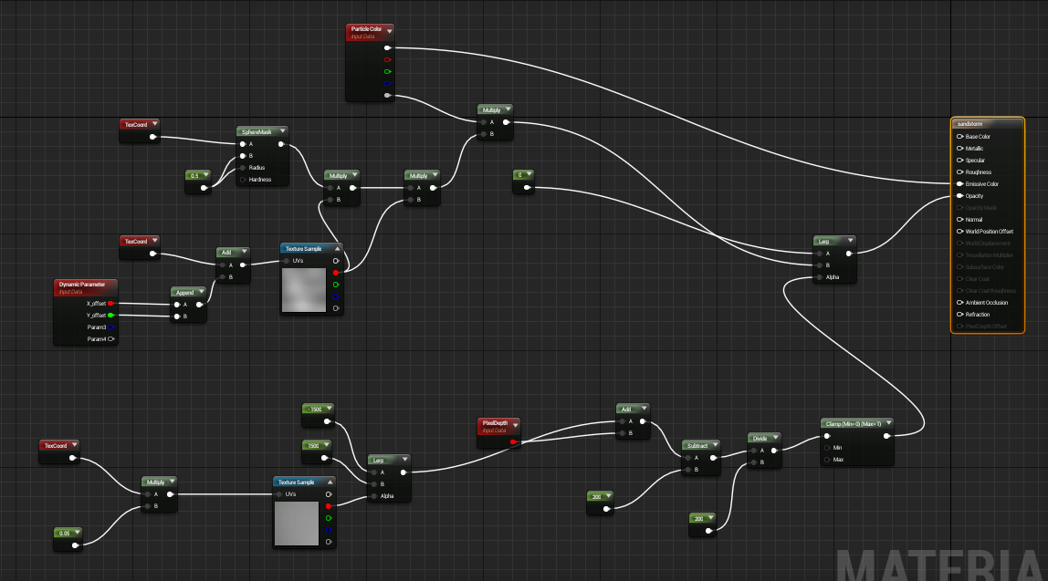
I found a few tutorials for snow which gave me the basic material set-up for an emitter material as you can see below but this was still only a tiny step towards completing the project.
It creates a basic black and white sphere through the sphere mask but as a sandstorm in not a perfect circle or just one sole gradient, i looked in to the smoke default material in a new project file. Through this and a German Youtube tutorial on creating smoke puffs, i worked out how to use a smoke mask and multiply this with the original sphere to create a more distorted shape.
For the physical sandstorm emitter I played around wit the options until i found something reasonable. Although this entire process took upwards of 7-8 hours due to my entire lack of experience;
Firstly, i set the emitter to "GPU sprites" otherwise it was impossible to render more than a few hundred at a time and then selected the sandstorm material i created. It seemed to be very important not to plug anything in to the base, metallic, specular or roughness channels of the material otherwise it either crashed UE4 or fail to display the particles. With the blend mode set to "Translucent", only plug nodes in to the Emissive colour channel and opacity. This does highly limit your colour variation though.
Secondly, I set the spawn rate to 100,000 as this provided 100% coverage like a real sandstorm. To ensure that the particles lasted long enough to cover a wide area of landscape, i set the minimum lifetime to 10 seconds and the maximum to 14.
The next step was to change the size and velocity. These were both trial and error but thankfully the UE4 particle editor runs fairly smoothly when changing values. All the Max size values for XYZ worked best at 500 whilst changing them all to 200 for the minimum values. The velocity values are a little more varied so i'll show them below;
To add a little more variation between particles, I used a "Initial Rotation" variable, setting the minimum to 0 and maximum to 1 which in turn gives the particles a small spin, helping to make them look more unique.
The final options were "Initial Location" and the "Color over Life" editor. Initial location simply specified the locations that it can spawn/ span across. As a sandstorm covers an entirely valley, this was a very awkward one to set-up and can always be changed on the fly. The options i found best are displayed below;
The colour is chosen in probably one of the weirdest ways imaginable. You have to move points on the colour selection graph until you have a value that you're happy with. I wont even try to explain my choice here as it was all random until i got a nice orange sand.
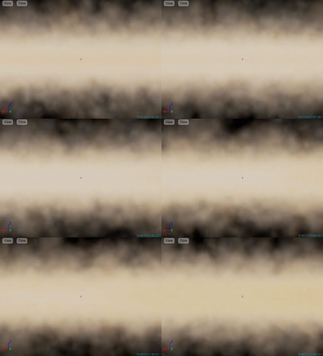
With all this done, I was left with a fairly nice effect that could span over my entire desert environment. Hopefully Gifs work on blogger;
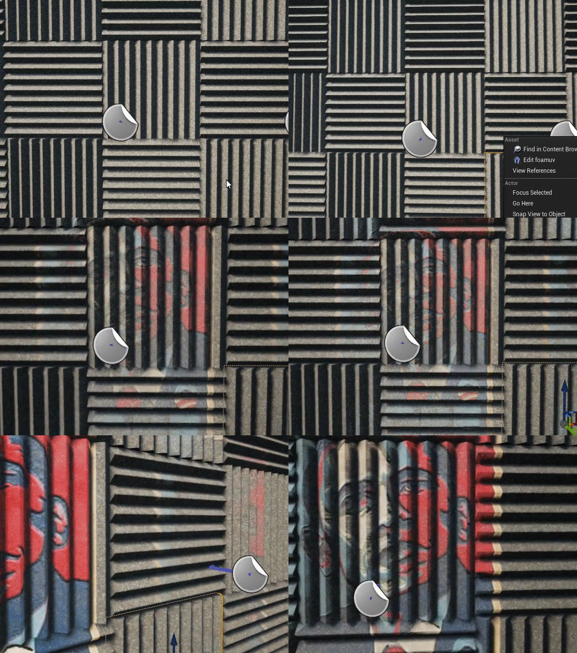
With this finalized, the last issue would be view distance but after playing with a few blueprint and node graph techniques over summer, i re-found my distance based opacity set-up that i used to well... Just look at the Gifs below. The easiest way to put it is that I learn complex methods best through the weirdest methods;
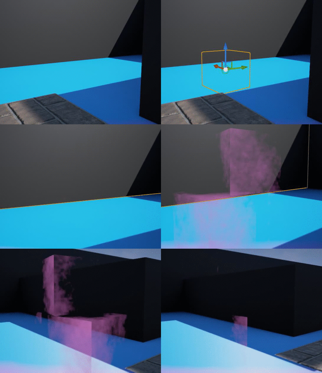
...and when put in to practise on an object, only using a LERP value for the opacity;
Anyway... With this method, I can simply copy and paste my graph set-up to any material I make and attach them togather with a LERP to control opacity based on distance. Honestly its such a wierd way of doing it when you see the graph that there should be no justification for it to work. We'll just call it the lucky accident.
The graph attached to the preexisting sandstorm material;
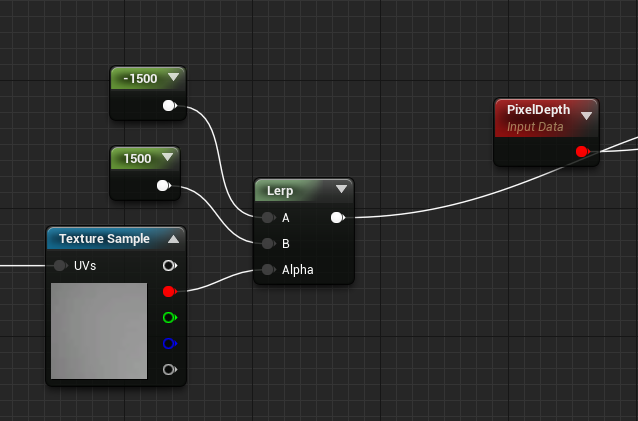
View distance has be controlled by either increasing or decreasing the below two values. It'll use the attached alpha mask for the transition so there are a lot of possibilities to play with. Just ensure the two values are kept as polar opposites;
I find that -1500 and 1500 work the best for my scene as you'll see the another Gif below;
The final stage of the sandstorm was to break up the single colour value that just looked far too fake. By duplicating the particle effect and material, i adjusted the colour to be a darker orange, placed this slightly below the original sandstorm emitter and ti created a nice orange contrast to highly the ground below the original sandstorm. This practically completes it. I attempted to use a height map to bring our depth in the tires but I couldn't fire this out without deforming the entire vehicle, lowering the overall quality.
With the sandstorm complete, there was one one more thing that needed to change. The starting point seemed very dull, consisting of a piece of metal with my name. After speaking to my lecturer, we found that it wasn't very necessary nor was it interesting enough to be a focus point for the camera transitions.
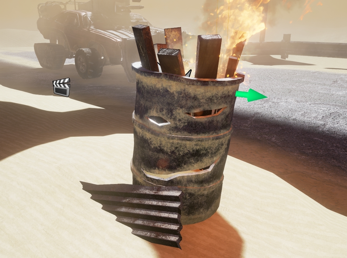
Being a Mad Max environment, what would be better than a flaming barrel to break up the monotony? On top of this, i could lean the old corrugated steel name tag against it to add a little more depth.
This is the result I ended up with, following the same Substance Designer seam-free bases, Photoshop masks and then finally. Substance Designer Touch-ups.
Fire seemed like an incredibly complicated effect to create but by taking the original fire emitter from the defaut scene and heavily modifying it, I managed to make a nice barrel flame with both the flame and smoke following the direction of the sandstorm.
I would have liked to make every single stage of this from nothing but I would be looking at upwards of a week of work for such a tiny task.
And the final point in this post. A little Easter Egg may become common across many of the matinee reals once you hit the marking stage... It's winter, remember to stay Toasty.
Final Painter Touch-ups and Critique
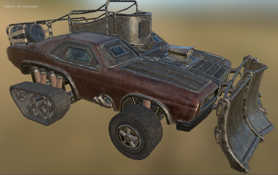
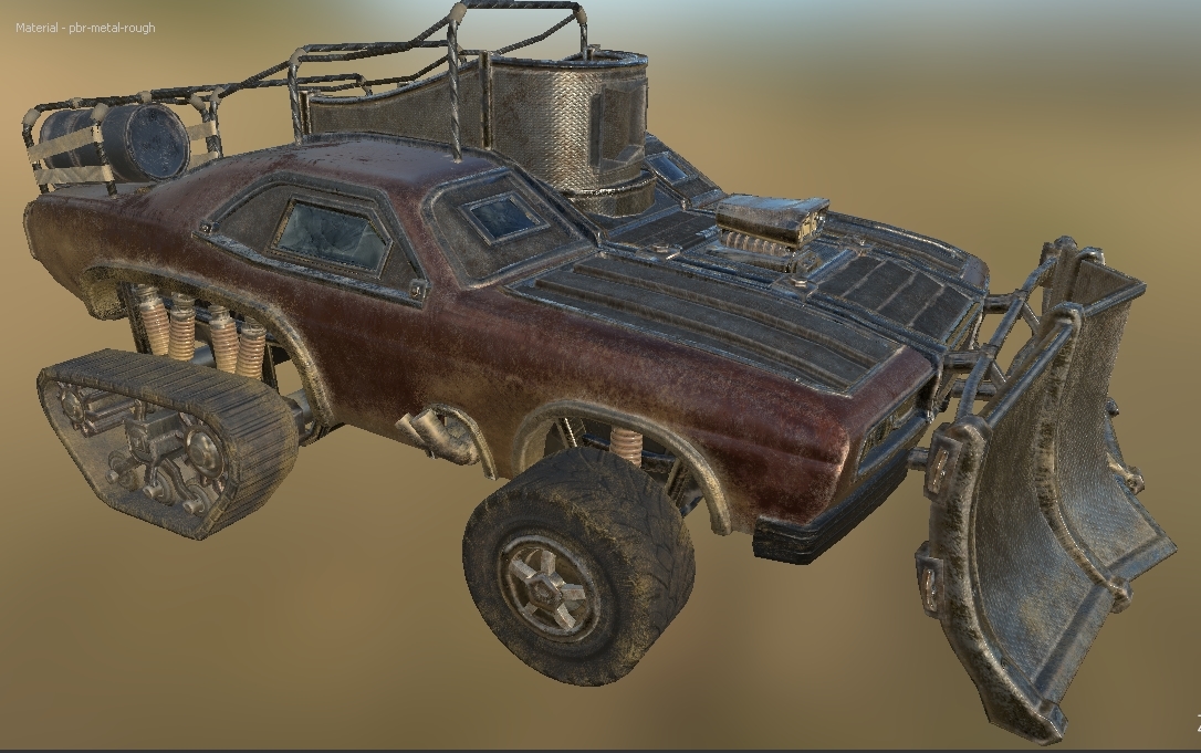
Before I could add extra details to the vehicle, I needed to address the feedback i received in the Alpha presentation and from classmates. It was stated that the vehicle simply looked far too cartoony and not very realistic. Almost as if it was a toy or miniature.
This was mainly caused by my roughness values which could be adjusted either in Photoshop or simply combined with a multiply node. On top of this, the metalness map was displaying only grey or black. This was due to substance designer's rendering method showing no errors in the surface reflection but as I created my main Photoshop document with masks as its backbone, nothing was ever destroyed after adjusting values. I could simply go back, select whole materials that needed adjusting and bring down a levels slider. As this was such a simple process, i added painter details at the same time as playing with roughness values so this next segment is a little out of order but still constitutes as the same stage.
With this all considered, I created three different variations to show class members and to receive feedback;
1). The original texture with its first sand pass.
2). The Mid ground.
3). The highest value.
With a monumental amount of feedback I ended up getting horribly mixed advice with a equal number of people going for each version and justifying it as the best. As this wasn't all too helpful, I eventually asked a few lecturers and decided to go on a mid-ground between the two highest values.
When it came to adding on extra details such as scratches, rust and sand, the easiest option was Substance Painter, especially as it was compatible with materials i had already created in Designer. On top of this, it meant i had to learn another software package which may be daunting and become a huge time sync but there was enough time available to do so.
I watched multiple tutorials by Algorithmic (the creators of Substance) until I got the grips of the software although this didn't end up being a monumental task; coming across as a mix between substance design and Photoshop, basically exactly what i was trying to convert Photoshop in to prior with all the masks.
As the exact same process was taken for both the gun asset and the vehicle, I'll only be covering the vehicle.
After importing the vehicle and applying each of the maps on a fill layer, I was given this as a starting point;
With roughness and metalness values fixed, it left me with the overly clean car body. I wanted everything at this stage to be mine so i refused to even touch the pre-made materials and instead, exported my sand texture and basic rust texture from Substance Designer alongside a set of parameters so i could further edit them in Painter.
These two materials made up 90% of the Painter touch-up details and after a lot of experimentation with the brushes, i found that a combination of "Pencil" for straight lines, "Sandpaper" for rougher areas and the multitude of scratch bushes for body detail made for the best combination.
For each new material, i created a fill layer with a black mask. This way i could just draw in white where i wanted a material in the exact same way i had been structuring Photoshop. Alongside this, it meant i could adjust the grey-scale value of the brush at any time to change material opacity.
With the rust detailing layer;
The whole premise of the rust detailing was to pick every edge in the entire model that would be caught by the sandstorms and other elements, breaking them up slightly and in turn, defining the geometry of the car greatly. As you can see from the comparison shots, the window frames, rims and other large, metal components are a lot more pronounced now. I believe this alone doubles the texturing quality. I went over almost every area of the car with varying scratch brushes where necessary, especially on areas such as the main body to make it look just a lot more battered and lower its gleam when its hit by the desert sun.
With the sand detailing layer;
Now, this one was a nightmare. It seemed impossible to get the sand location and intensity right so i ended up with upwards of ten different variables. The main problem i faced here is that the sand looked horribly out of place unless it was within the environment. Once i began exporting the textures out and applying them to the physical scene, it made the process much easier. I believe im set on this now after adding some sand spooling but i cannot get the roughness perfectly where i want it.
Final little additions.
As the vehicle rubber looks fairly dull, i wanted to just add a little something to spruce it up. A slight metal contrast did the trick as both the wheels and tracks had metal pieces in the high poly model and normal map, i had just entirely forgot about this.
With the extra little addition;
I feel like this finished off the texture work nicely.
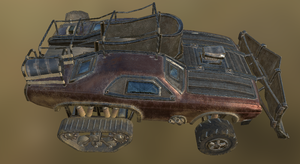
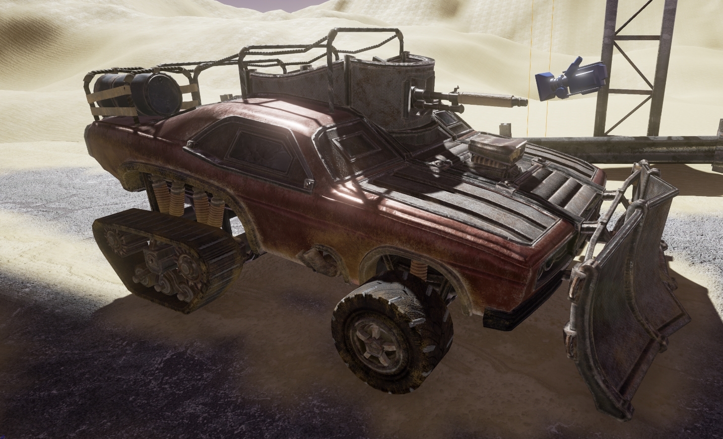
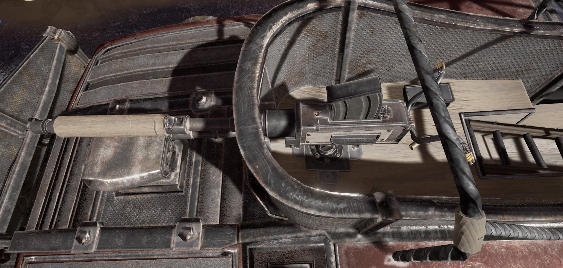
Now a few high-resolution renders from engine just to give you a better feel for the UE4 rendering;
Overall, i'm very happy with how the texturing has gone up to this stage. It was an incredibly awkward path, forcing me to learn multiple software suites and entirely re-evaluate my texturing methodology but i believe the result speaks for itself when you take in to consideration that i made every last texture for the scene out of individual nodes.
Alpha Presentation Review
Alpha Presentation
For the most part, I believe the alpha presentation went really well. I gave a full breakdown of every stage, problems faced, the roadmap, what was left, etc... Basically ensuring that every area of the criteria was met. To make this segment easier, I re-recorded the Alpha presentation at home so it can be re-watched in hopefully the same quality as I presented it.
https://www.youtube.com/watch?v=alZcs8Eba2Y
I'll still provide a basic breakdown of each slide but that link is always available if you want to save some time.
1).
To make this presentation almost a continuation of the prior one, i used the first starting slide as it was familiar and reminded anyone watching what the original idea was before i even began to speak.
2).
Same premise of the first slide, this worked as a good re-cap of past ideas so I could explain what the original plan was before moving on to a full breakdown of what went good,bad and how this issues were overcome.
3).
The final re-cap slide, explaining that the high poly model was completed for the last presentation and that the low poly model was underway. This then paved the way to the full breakdown.
4).
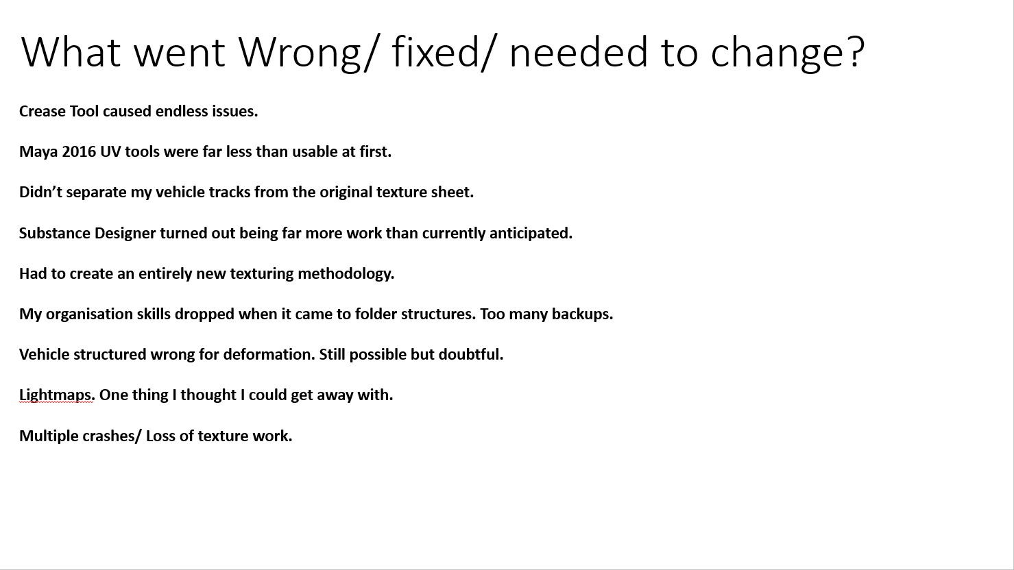
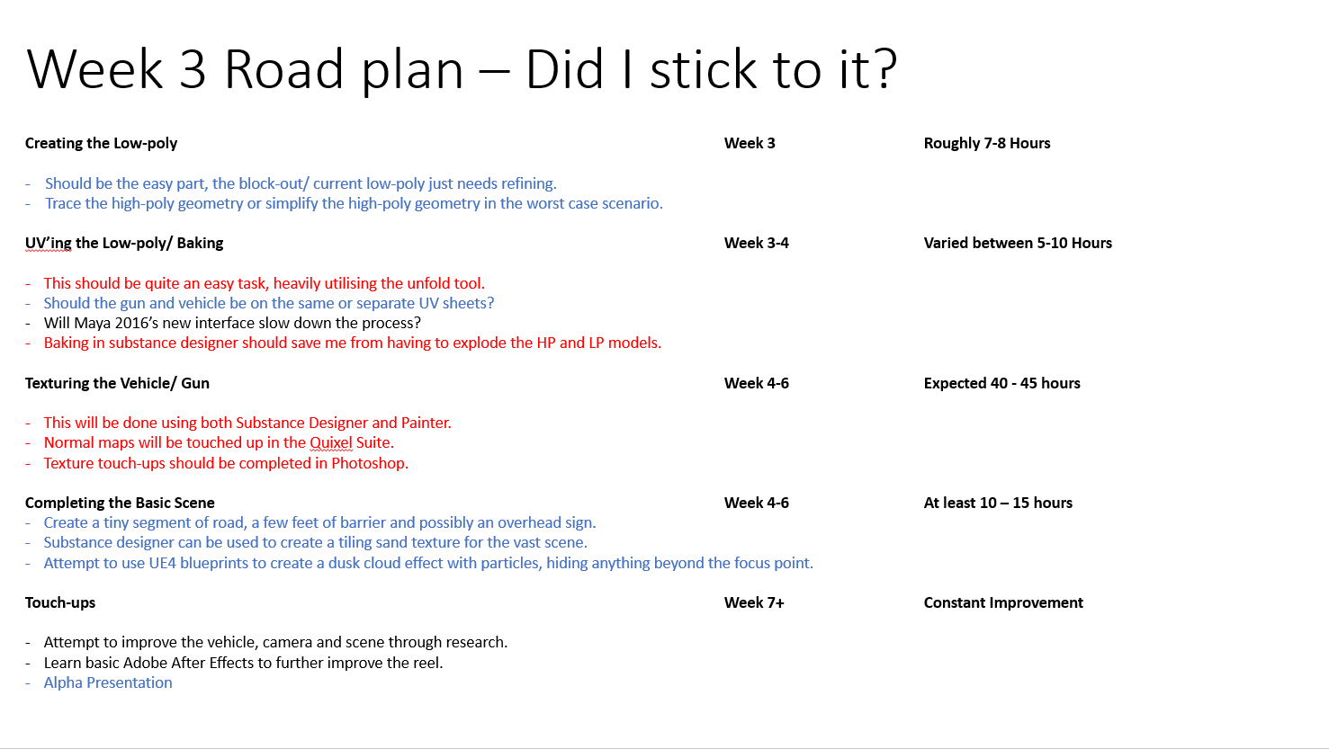
This slide is covered in great detail in the video I linked at the start and took up a large chunk of presentation time but on its own managed to cover a large amount of the total presentation criteria as a fail-safe if I were to get cut-off at the five minute mark.
5).
Simply covering the prior slide in slightly less detail, this was a breakdown of areas i stuck with in blue and areas that i struggled with in red such as having to entirely develop an new texturing methodology.
6).
This was the actual matinee sequence with some heavy Sony Vegas video editing. Probably the easiest way to access this would be to load up the original video I linked as it also comes with full narration/ commentary. Whilst physically giving the presentation, the projector changed the resolution of my MP4 to 4:3, ruining it to quite an extent and made the video lag terribly. I had no control over this was it was down to luck of the draw with the presentation computer if it decided to play the videos correctly or not.
7 & 8).
These were quite literally quick, high detail shots of the scene to make up for the matinee's lower resolution.
9 & 10 & 11).
These slides let me do a quick overview of how i brought the low poly to the partially finalized vehicle with normal map.
12).
This slide was rather awkward to explain in limited time as it was the driving force behind my texture work and the seamless substance designer texture generation.
13).
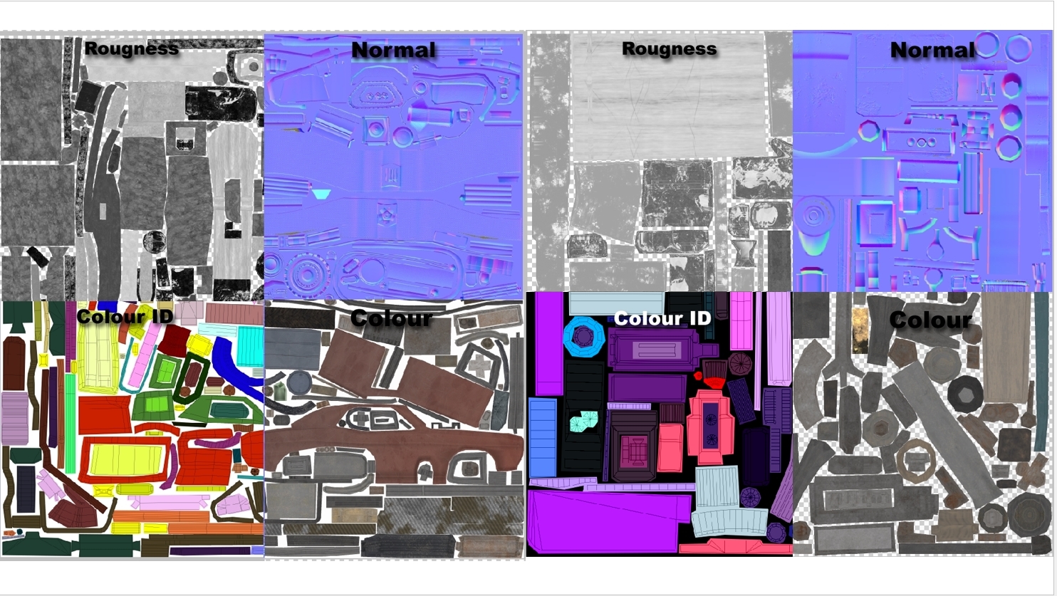
To ensure nothing was left out, I even showed snippets of each of the maps used in the texturing process just so absolutely every last stage was covered. It may have been overkill but the whole premise was the get as many people asking questions as possible.
14).
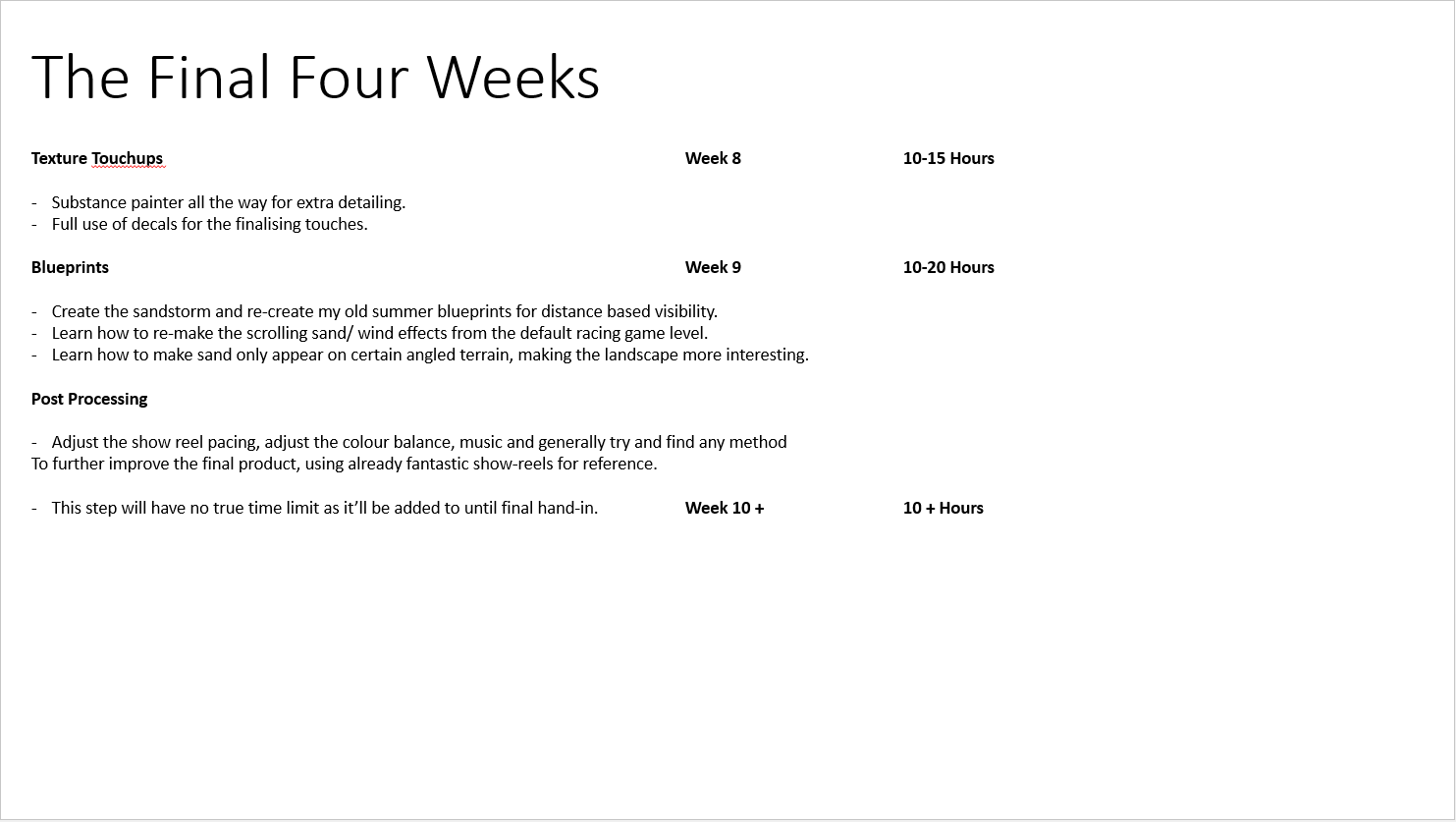
This covers the final area of the presentation criteria, going through the final month and what would be accomplished with set time frames. As i had already covered software suites extensively in past slides, not all too much detail went in to this but with the 5 minute cut-off period, it seems in retrospect, a terrible idea to put this right at the end.
Overall i received a lot of useful feedback. I really wish i had more from the class as no one exactly seemed all to talkative.
Subscribe to:
Comments (Atom)


